If you are a homepreneur who is just getting started with your e-commerce store or if you are a corporate retailer who is planning to expand your presence online, then this might be an insightful blog for you in which you will explore the nuances of UI design that will make your brand highly saleable online.
What’ is UI design?
Some of you might already have a basic understanding of UI (User Interface). For those of you who do not know, basically, UI is where human-computer interaction happens. How is this interaction facilitated? Through DESIGN. So, typically, UI is the design of your app or website that lets users interact with your brand using graphics or text or voice commands.
Earlier a website just used to have text-based UI, but today the concept of UI has evolved so much that you can experiment with lots of design components like graphics, color gradient, typography, animation and what not.
Here are 10 UI design trends you need to know in 2024.
To build an enjoyable UI for your users, there are a few design principles you need to consider.
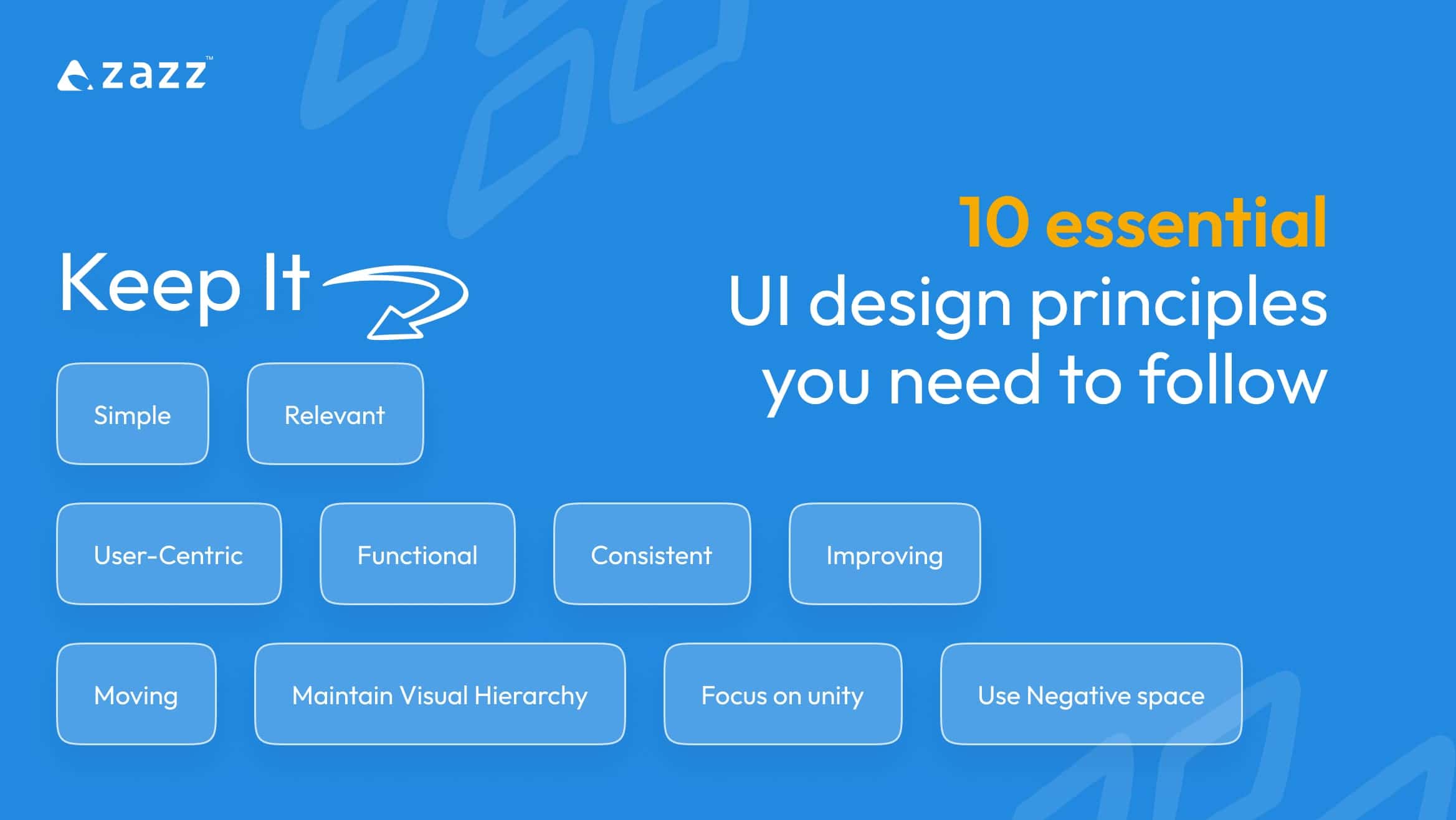
10 essential UI design principles you need to follow:

There is no secret to building a successful UI. All you need to do is, be mindful of what you are creating for your users. Whether you are building an app or a website, there are certain fundamental UI design principles you need to follow that will make your brand’s online presence a win!
- Keep it simple:
“Too much of anything is good for nothing”. Clouding them with too much text or graphics or too much of anything will land your efforts in vain. Users today are not up for dealing with any complexity whatsoever. The more you make the UI complex, the more is the risk of losing your customer. So, keeping it simple is the key. Simplify your UI as much as you can to deliver the best user experience for your customers.
- Keep it relevant:
Times changes, trends change, so should your UI accordingly. UI is not about creating it once and having it for lifetime, it has to be dynamic enough to adapt to the new UI/UX design trends & technology trends. For example, minimalistic design, integrating AI assistance are some of the popular trends that are being adapted today.
- Keep it User-Centric:
Your brand revolves around your audience. So, Catching on to the audience pulse is important before designing your app’s or website’s UI. Every element on the UI- be it, text or design or navigation buttons, including the placement of all these on the layout, need to be well-thought out from your user perspective.
- Keep it functional:
You may create an aesthetically pleasing UI, but it can still lose its value if it is functionally poor. Focus more on keeping the UI more functional, that is, everything your user clicks or consumes on your UI has to be essential for them. Delivering a great design that lacks function, is like driving your audience to a scenic dead-end.
- Keep it consistent:
Consistency is what makes your brand memorable. Inconsistencies on the UI is often an ignored factor which needs your attention the most. Inconsistency will distract and confuse your audience making your brand less memorable. The best way to maintain consistency on the UI is to strictly follow your brandbook. While you may think that experimenting with different types of fonts & colors on UI is fun, you run the risk of losing your identity among the audience.
- Keep improving:
Once you are done creating UI, observe the interaction pattern of your customers and keep improving your UI. Take every feedback seriously as that’s what will pave the way for achieving the best UI.
- Keep it moving:
Moving design attracts attention better. Use micro animation & keep the design moving on the UI as it engages the audience better than static images.
- Maintain Visual Hierarchy:
Decide how you want your audience to consume the content on the UI and structure it in the order of importance.
- Use Negative space:
Your UI will wear off if you do not give importance to negative space. A negative space is a white space that can be used in between the layout to eliminate crowding, thereby improving the attention span of the users.To break the monotony in the design, usage of negative space is essential.
- Focus on unity:
A UI that is equally proportionate & rightly aligned creates a visual unity. This lets the audience navigate easily.
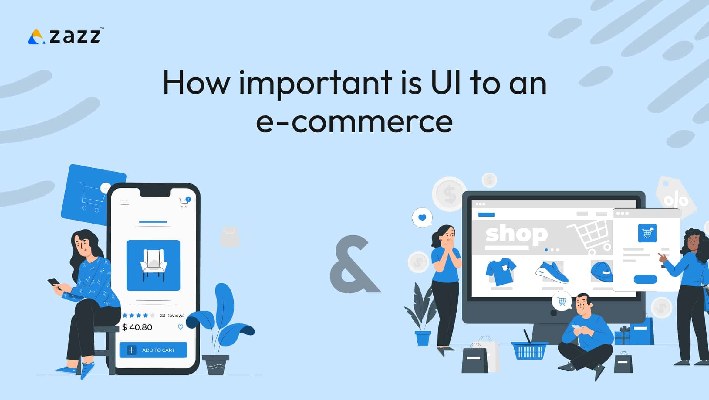
How important is UI to an e-commerce app & an e-commerce website!

Building an e-commerce store needs more effort and clearer strategy compared to other apps or websites. Specifically, if e-commerce store is the mainstream revenue avenue for your business, then UI plays a major role in the sellability of your product or service as it significantly influences your customers’ decision making.
How does it influence your customers’ decision making? Let’s understand with the following scenarios.
Generally, the initial attention span of a buyer online is not more than 5 seconds, and your UI has to be irresistible enough to captivate the attention of a user within those 5 seconds, to scroll through and know more. There are many overlooked factors that can repulse your audience within those seconds.
Let’s say, a customer comes to your e-commerce store in search of a product and your UI takes more than 5 secs to load, then you have lost the buyer already. So, make sure your UI loads faster.
Okay, let’s say you have attracted the customer within their attention span. The customer has liked a product in your e-commerce store and has added it to the cart but, your payment UI has too many redirects hampering them from making the payment. Again, you have lost a customer because of poor UI.
It’s crucial for your e-commerce store to have user-friendly design that will make them explore your products with ease. Though their ultimate buying decision depends on what you sell, it is importance to note that if the selling medium is poor, you can still lose a customer.
The more convenient your customers feel on your app or website, the more likely they are to show up again. The design principles mentioned above are to be taken seriously to achieve this.
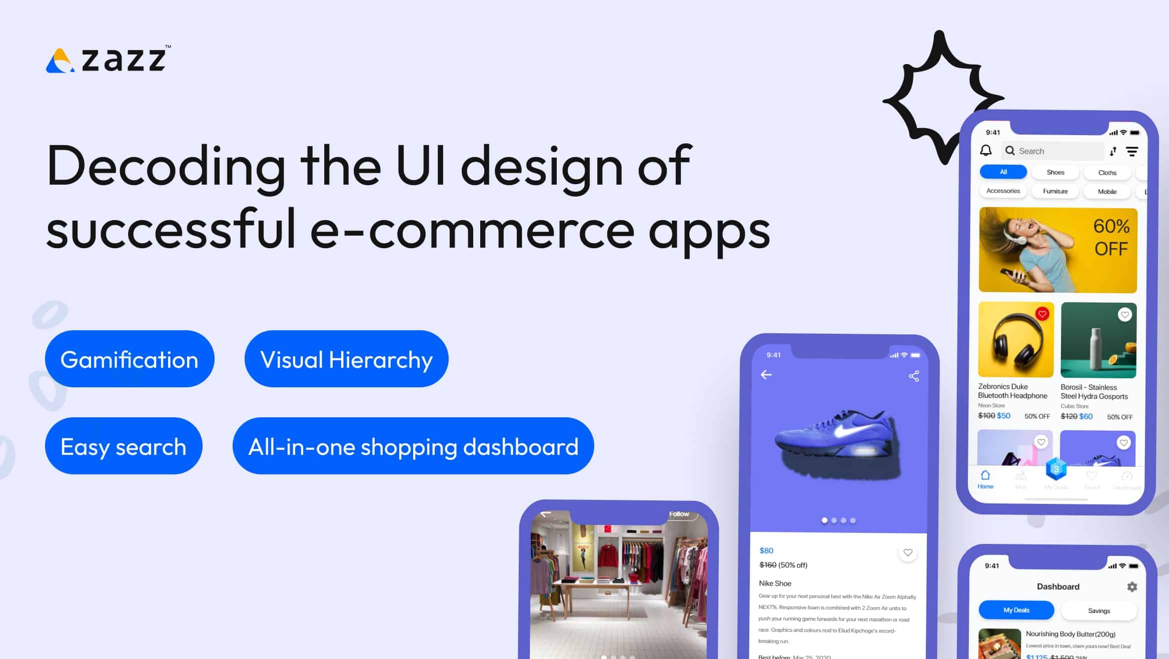
Decoding the UI design of successful e-commerce apps

Let’s have a look at the UI of some of the successful e-commerce brands and see what lesson they have in particular for every budding e-commerce brand to take home.
Temu:
Temu is one of the go-to e-commerce stores across many places in America, Europe and Asia. This recently founded (2022) online marketplace has been experimenting with its UI ever since its launch with an intent to give users an entertaining & easy shopping experience. Here is how.
- Gamification: The app opens with a “spin the wheel” game that consists of exciting rewards for users, thereby capturing their interest to shop
- Visual Hierarchy: The app displays lightening deals at the top, followed by popular or most-bought products and gradually takes audience through the other less-intriguing purchase options.
- Easy search: The app is guiding enough for customers for find a specific product with its autocomplete functionality, & product suggestions based on popular searches simplifying shopping experience for customers.
- All-in-one shopping dashboard: The app doesn’t redirect users to separate pages for every action. It has a dynamic interface that lets users explore their options on a single page without the need for users to navigate much, which in turn minimizes distraction and facilitates faster checkout.
- Responsive & functional: The app is hyper responsive & functional making sure that it doesn’t waste a shopper’s time. The app has smooth, no-complex transactions allowing no room for lags that might frustrate the user.
However, Temu didn’t have the same UI when it was launched. There were a few flaws. For instance, earlier, Temu didn’t have the option to shortlist a product. But the company took every customer feedback on their UI seriously and worked on it without an excuse which is what made Temu the competitive e-commerce store that it is today.
Decoding the UI design of Amazon & Walmart
Both Amazon & Walmart are well-established brands that have been into business for a longtime now. Retaining customers after getting established is equally important as gaining customers while getting started. These two brands gradually grew to become the most-visited online stores. How did they do it?
The brands never failed to evolve its UI, but the one thing that remained constant throughout is they worked more on the functional aspect of the app more than the aesthetic aspect. With its simple UI characterised by Unity, visual hierarchy & functionality, these two brands have made themselves the reliable online shopping store for customers.
If you are someone looking forward to creating an amazing UI for your e-commerce store or if you are looking forward to perfecting your existing UI, you can gather a lot of insights from exploring the above mentioned brands. Furthermore, choosing skillful team to build your UI is important for the result to turn out well.
How To Choose The Perfect UI/UX Design Agency?
There are many UI/UX design companies out there. But choosing the right one for you is a little tricky.
As a first step, you must have your objectives defined before approaching any UI/UX design company.
Knowing the basics principles of UI will help you lot in assessing the companies you choose because you can be as interrogative as possible when you know what you want.
Do a groundwork. Analyse the company ‘s portfolio and read client reviews to know the company better.
Get expert guidance at Zazz to successfully build an UI that works for you!
Conclusion:
Ever since technology took over the retail industry services, the scope for market diversification has tremendously increased widening the revenue streams for retailers. Being a homepreneur is a thing today because e-commerce development has made remote selling a hit . Every seller out there can sell their service or product online without actually having a physical store. Yes! It is exciting… however there’s a catch here. It comes with its own challenges.
While it widened the revenue stream for remote sellers, it also widened their competition in the market. There is a constant need to stay distinguished to thrive in the market. Therefore, Do not compromise on your UI and never take your customers’ feedback lightly. As Steve Jobs rightly stated “Design is not what it looks like or feels like, Design is how it works!” – It’s not the design that retains the users, how it works does!
For more such blogs, follow Zazz.io
Frequently Asked Questions
Zazz is one of the trusted design companies delivering the best quality design for its clients over the past 15 years.
UI is the design that a user sees and interacts with on your website or app. UX is what a user experiences while interacting with the design.
Go through their portfolio, schedule a call with them, ask as many questions as you want, go through client reviews- all these will help you find a company that fits your needs.
Considering the fact that Temu has become a competitive online market place out there within a few years of its launch, there is a possibility, but not any time soon provided the big players up their game.


